
![]()
![]()
![]()
![]()
![]()

Sunlight in Casa Grande
Part 1
1. You are going to collect sunrise and sunset times for Casa Grande in 2009. Fortunately, there is a Web site where you can get this information so you don’t have to wait a year to collect it all!
2. Open Internet Explorer and go to this Web site: http://aa.usno.navy.mil/data/docs/RS_OneDay.html
3. Number your paper from 1 to 12 and record the sunrise and sunset data for the first day of each month for 2009 for Casa Grande.
4. When writing the time, be sure to use this format: 7:03 AM, 5:08 PM.
5. When you have written down both times for all twelve months, minimize Internet Explorer and open Excel.
Part 2
Excel is a spreadsheet program.
|
|
A |
B |
D |
C |
E |
F |
G |
|
1 |
|
|
|
|
|
|
|
|
2 |
|
|
|
|
|
|
|
|
3 |
|
|
|
|
|
|
|
|
4 |
|
|
|
|
|
|
|
A spreadsheet is a document which helps you organize or store data in a grid of rows and columns like in the illustration above. The rows are labeled using numbers (1, 2, 3, etc.) and columns are labeled with letters (A, B, C, etc.). The rectangles in a spreadsheet are called cells. Cells are named by their location.
The first cell in the top left corner is
A1 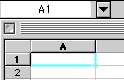 and
when your cursor is in a cell it will be highlighted.
and
when your cursor is in a cell it will be highlighted.
You can also tell what cell your cursor is in by looking in the Name Box above column A. [In the illustration above the highlighted cell is A1 and the Name Box above it shows “A1”. To move down a column push the Enter key. To move across a row push the Tab key.
Type your information in the spreadsheet.
In cell A2 type January.
In cell A3 type February.
Instead of typing in the rest of the months Excel can do this for you! Highlight January and February, and release the mouse button. If you look at the bottom right-hand corner of the cell containing the word February, you will find a small black square or "bucket". Click on the bucket and drag it down. As you drag it down you will see the months of the year following as you highlight the next cell. Drag the bucket down until you fill in all of the months of the year.
In cell B1 type Morning.
In cell C1 type Evening.
In cell D1 type Daylight.
Highlight columns B and C by clicking on the letter B at the top of the column and dragging across to C.
Click on Format on the toolbar and then click on Cells.
Click on Custom and go down the list of options until you reach h:mm:ss AM/PM and click on OK.
Highlight Column D and click on Format on the toolbar. Click on Cells, then Custom. Go down the list of options until you reach h:mm and click OK.
In Cell D2 type =C2-B2. This is a formula. You are telling the computer to subtract the contents of cell C2 from cell B2. By typing your formula using the contents of the cells instead of the numbers, you will be able to "apply" or use this same formula with other cells.
Type in your data in columns B and C.
Highlight cell D2 and go to Edit on the toolbar and click on Copy. This will create a flashing light around this cell.
Highlight cells D3 through D13.
Click on Edit on the toolbar and click on Paste.
Click on an empty cell on the spreadsheet.
The amount of daylight will automatically be calculated for you in column D
**Next you are going to create bar graph of your data.**
You are now going to create a graph using the chart wizard.
To use the chart wizard your first have to tell it what cells are going to be included in your graph. You are going to use columns A and D. Click in A2 then while holding down the left mouse button, drag down the column. After you have highlighted column A, release the mouse button and click on the control (the button is the furthest button on either side on the bottom row of your keyboard) with your left-hand.
![]()
Click with your mouse in D2 and holding down the mouse button drag through D13. Release both mouse button and control button! The chart wizard will now use the months and the number of hours of daylight to create your graph!
Next, click on the chart wizard button on the toolbar. The chart wizard is located on the toolbar and it looks like this .
A window will appear with different types of graphs. You will be using the first one- Column. Click on Next. Click on Next again. Make sure that the Titles tab is showing, if not click on it. In the Chart Title box type Daylight for One Year. For Category X axis, type First Day of Month and for Value Y axis, type Amount of Daylight. Click on the tab for Legend and click in the box beside “Show Legend”. This will remove it from your graph. Click on Finish. Your chart will now appear on the same page as your data.
Part 3
Using your graph answer the following questions on your paper:
a. What is the pattern for the amount of daylight during the course of a year for your hometown?
b. Why do some days have more daylight than others?
c. What month had the most amount of sunlight?
d. What month had the least amount of sunlight?
Adaptation of Microsoft lesson by Linda DeVore
Last Updated Wednesday, October 13, 2010